

Views: 0
A practical 2026 typography guide for startups, covering font psychology, multi-script branding, accessibility, and a step-by-step framework for choosing brand fonts.
Table of Contents
- 1 Introduction
- 2 Why Typography Deserves Strategic Attention
- 3 The Psychology of Typeface Categories
- 4 Understanding Font Weight, Spacing, and Structure
- 5 The Unique Challenge of Multi-Script Branding in India
- 6 Step 1: Define Your Brand Personality Before Choosing a Font
- 7 Step 2: Choose a Primary Typeface for Headlines and Branding
- 8 Step 3: Select a Body Font Optimized for Readability
- 9 Step 4: Build a Typography Hierarchy
- 10 Step 5: Test Typography Across Devices and Scripts
- 11 Step 6: Ensure Accessibility and Contrast
- 12 Step 7: Choose Licensing and Technical Implementation Wisely
- 13 Step 8: Document Your Typography System
- 14 Common Typography Mistakes Indian Startups Make
- 15 Typography Trends Shaping Indian Startup Branding in 2026
- 16 A Practical Example: Typography for a Bilingual Fintech Startup
- 17 Frequently Asked Questions
- 18 Conclusion
- 19 Need Typography Guide for Your Business?
Introduction
Typography is one of the most overlooked branding decisions a startup makes, and also one of the most consequential. Long before a customer reads what your brand actually says, the shape, weight, and spacing of your letters are already shaping how trustworthy, modern, premium, or approachable you feel. A strong product wrapped in mismatched, hard-to-read fonts can lose credibility before a single sentence registers.
For Indian startups, this challenge carries an extra layer most global typography guides never address — the reality of designing across multiple scripts. A brand speaking to audiences across Hindi, English, and regional languages like Tamil, Bengali, or Marathi needs a typography strategy that holds together visually across very different alphabets, not just a single elegant English font. This guide walks through how to choose, pair, and apply typography correctly for an Indian startup brand in 2026.
Why Typography Deserves Strategic Attention
Typography isn’t simply a design detail finalized after the “real” branding decisions are made. It directly affects readability, brand perception, and even conversion rates. A beautifully designed landing page with a hard-to-read font can quietly drive visitors away before they ever engage with the actual message, regardless of how strong the underlying offer is.
Typography also carries psychological weight similar to colour. A rounded, friendly typeface communicates something very different from a sharp, geometric one, even when displaying the exact same words. For a startup still building brand recognition from scratch, getting this right early prevents the kind of inconsistent, forgettable visual identity that makes it harder to stand out as the brand scales.
The Psychology of Typeface Categories
Most fonts fall into a handful of broad categories, each carrying distinct psychological associations worth understanding before making a selection.
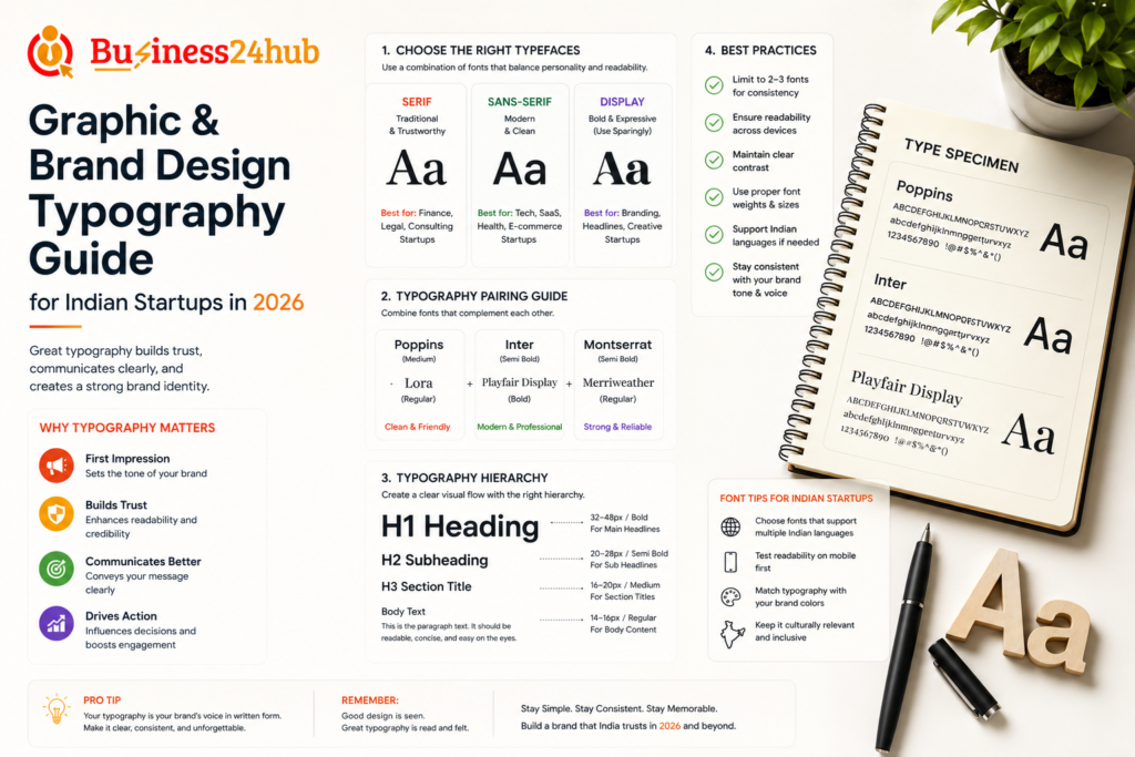
Serif fonts, with their small decorative strokes at the ends of letters, tend to communicate tradition, authority, and trustworthiness, which is why they remain common in legal, financial, and editorial branding. Sans-serif fonts, without those strokes, feel cleaner, more modern, and more neutral, making them the dominant choice across technology and SaaS startups in 2026. Slab serif fonts combine bold, blocky strokes with serif structure, often used to project confidence and strength without feeling overly formal.
Script and handwritten-style fonts feel personal, creative, and informal, useful for lifestyle or artisanal brands but risky for anything requiring quick readability at small sizes. Display fonts, designed with bold, distinctive character, work well for short headlines and logos but become difficult to read in longer body text, making them unsuitable as a primary content font regardless of how striking they look in isolation.
Understanding Font Weight, Spacing, and Structure
Beyond choosing a typeface family, the specific weight, spacing, and proportions you select significantly affect how a font is perceived. Heavier, bolder weights tend to feel more confident and authoritative, while lighter weights feel more refined, minimal, or premium, depending on the surrounding design context.
Letter spacing, often called tracking, also shapes perception. Tighter spacing can feel more dynamic and energetic, while generous spacing often communicates calm, premium positioning, frequently seen in luxury branding. Line height, the vertical spacing between lines of text, directly affects readability, particularly important for longer content like blog posts or product descriptions, where cramped line spacing can make even well-chosen fonts feel exhausting to read.
The Unique Challenge of Multi-Script Branding in India
This is the area where most generic typography guides fall short for Indian startups. A brand operating across Hindi, English, and potentially other regional languages needs typefaces that work harmoniously across different scripts, not just a strong English font applied inconsistently elsewhere.
Devanagari script, used for Hindi and several other Indian languages, has its own structural characteristics, including a distinctive horizontal line running along the top of most characters, called the shirorekha. A typeface family offering both Latin and Devanagari support, designed with visual harmony in mind, produces far more cohesive branding than pairing an unrelated English font with whatever default Devanagari font happens to be available.
Similarly, scripts like Tamil, Bengali, Telugu, and others each carry distinct visual structures that don’t always pair naturally with typefaces designed primarily for Latin alphabets. For startups genuinely operating across multiple Indian languages, investing in a type family specifically designed with multi-script consistency, or working with a typographer experienced in Indian scripts, prevents the disjointed feeling that comes from forcing visually mismatched fonts to coexist within the same brand identity.
Step 1: Define Your Brand Personality Before Choosing a Font
Just as with colour, typography choices should flow directly from a clearly defined brand personality, not personal preference or whatever font happens to be trending. Revisit your brand’s core traits: is your startup bold and disruptive, calm and reassuring, premium and exclusive, or approachable and friendly?
A fintech startup positioning itself around trust and security needs a fundamentally different typographic feel than a youth-focused fashion brand aiming for energy and individuality, even if both are technically targeting urban Indian millennials. Letting brand personality guide font selection, rather than the reverse, consistently produces more coherent, strategically sound results.
Step 2: Choose a Primary Typeface for Headlines and Branding
Your primary typeface is the one most associated with your brand identity, typically used in your logo, major headlines, and key marketing materials. This font carries significant weight in shaping first impressions, so it deserves careful, deliberate selection rather than a quick default choice.
Consider how your primary typeface needs to perform across different sizes and contexts, from a small app icon to a large outdoor hoarding. Highly decorative or unusual fonts that look striking in a large headline often become illegible or lose their character entirely when scaled down, so testing across multiple sizes early in the selection process prevents costly inconsistency later.
Step 3: Select a Body Font Optimized for Readability
Your primary brand typeface is rarely the right choice for lengthy body text, such as blog content, product descriptions, or app interfaces. Body fonts need to prioritize readability above personality, since visitors spending extended time reading dense content will quickly abandon anything that strains the eyes, regardless of how on-brand it feels.
Most successful startup typography systems pair a more distinctive, characterful primary font for headlines with a cleaner, highly legible sans-serif or serif font for body content. This pairing allows brand personality to shine through in prominent moments while ensuring the bulk of actual reading content remains comfortable and accessible.
Step 4: Build a Typography Hierarchy
A consistent typography hierarchy ensures visitors can quickly scan and understand the structure of your content, distinguishing headlines from subheadings, body text, and smaller supporting details like captions or footnotes. This typically involves defining clear size, weight, and colour relationships between heading levels, body text, and smaller UI elements.
Without a defined hierarchy, designers and content creators within a startup often make inconsistent, ad-hoc decisions about font sizing and weight across different pages or materials, leading to a visually inconsistent brand experience that subtly undermines professionalism, even when individual pieces of content look fine in isolation.
Step 5: Test Typography Across Devices and Scripts
Given India’s overwhelmingly mobile-first internet usage, typography decisions need rigorous testing on actual mobile devices, not just a designer’s desktop monitor. A font that looks elegant and spacious on a large screen can become cramped, difficult to read, or oddly proportioned on a smaller mobile display, directly affecting user experience for the majority of your actual audience.
For startups operating across multiple Indian languages, this testing phase becomes even more critical, since rendering behaviour for non-Latin scripts can vary across different devices, operating systems, and browsers in ways that aren’t always immediately obvious during initial design work. Testing real content, in real scripts, on real devices your target audience actually uses prevents unpleasant surprises after launch.
Step 6: Ensure Accessibility and Contrast
Typography accessibility extends beyond font choice alone. Sufficient contrast between text and background colours, appropriate minimum font sizes for body content, and adequate line spacing all directly affect readability for users with visual impairments or simply those reading in less-than-ideal conditions, such as bright outdoor sunlight on a mobile screen, extremely common in India’s climate and usage patterns.
Avoid setting body text below a comfortable minimum size purely for aesthetic minimalism, and resist overly thin font weights for body content, which can become difficult to read on certain screens despite looking refined in design mockups. Testing your typography choices against accessibility contrast standards should be a standard step in your design process, not an afterthought.
Step 7: Choose Licensing and Technical Implementation Wisely
Not every visually appealing font is free to use commercially, and licensing terms vary significantly between free, open-source typefaces and premium fonts requiring paid licensing for commercial use. Before finalizing a typeface, confirm its licensing terms cover your intended use, including digital applications, app embedding, and any printed marketing materials.
For web and app implementation, font loading performance also matters, since slow-loading custom fonts can delay how quickly your website or app feels usable, directly affecting both user experience and search engine performance metrics. Choosing well-optimized font formats and limiting the total number of font weights and styles loaded on any single page helps maintain fast loading times without sacrificing brand personality.
Step 8: Document Your Typography System
Once your typography decisions are finalized, document them clearly in a brand style guide, specifying exact font families, weights, sizes, and use cases for headlines, subheadings, body text, and UI elements. This documentation becomes essential as your startup grows beyond a single founder or designer making every visual decision personally.
Without clear documentation, typography inconsistency tends to creep in gradually as different team members, freelancers, or agencies contribute to various marketing materials over time, each making slightly different assumptions about which fonts and sizes apply where. A simple, clear reference document prevents this drift and keeps your brand visually consistent as more people contribute to its execution.
Common Typography Mistakes Indian Startups Make
Using too many different fonts across a single brand identity is one of the most frequent mistakes, creating a fragmented, unprofessional feeling rather than a cohesive visual identity. Most strong startup brands limit themselves to two, or at most three, typeface families used consistently across all materials.
Choosing decorative or trendy fonts for body text is another common error, prioritizing short-term visual appeal over long-term readability, particularly damaging for content-heavy pages like blogs or product descriptions where visitors are expected to read extensively.
Ignoring multi-script consistency is a uniquely costly mistake for Indian startups specifically, often resulting in an English identity that looks polished and intentional, paired with a Hindi or regional language version that feels like an afterthought, visually disconnected from the rest of the brand.
Failing to test typography on actual mobile devices, given India’s mobile-first usage patterns, frequently leads to readability issues that only become apparent after launch, when user feedback or analytics reveal unexpectedly high bounce rates on text-heavy pages.
Neglecting accessibility considerations, including insufficient contrast or font sizes too small for comfortable reading, can quietly exclude a meaningful portion of potential customers while also creating legal and ethical risk increasingly relevant in 2026.
Typography Trends Shaping Indian Startup Branding in 2026
Several trends are influencing how Indian startups approach typography this year. Variable fonts, which allow a single font file to flexibly adjust weight and style without loading multiple separate files, are increasingly popular for their performance benefits, particularly valuable given India’s varied internet speeds across different regions.
Multi-script type families specifically designed for harmony between Latin and Indian scripts are becoming more widely available and increasingly adopted by startups serious about consistent regional branding, rather than treating non-English typography as a lower-priority afterthought.
Bold, confident sans-serif fonts continue to dominate technology and SaaS branding, reflecting a broader preference for clean, modern simplicity over more decorative or traditional typographic styles. At the same time, a counter-trend toward distinctive, characterful display fonts for specific brand moments, such as logos or major campaign headlines, is helping some startups stand out against an increasingly homogeneous sea of generic, safe sans-serif choices.
A Practical Example: Typography for a Bilingual Fintech Startup
Consider a fintech startup offering services in both English and Hindi, targeting a broad pan-India audience including both metro professionals and Tier 2 city customers newer to digital financial tools. Their brand personality is defined as trustworthy, clear, and approachable, deliberately avoiding anything that feels overly playful or casual given the sensitive nature of financial services.
They select a clean, highly legible sans-serif typeface family offering strong Devanagari support alongside its Latin character set, ensuring visual consistency between their English and Hindi materials rather than treating Hindi typography as a secondary consideration. For headlines, they use a slightly bolder weight of the same family to maintain brand consistency while still creating clear visual hierarchy, rather than introducing an entirely separate decorative font that might undermine the trustworthy, professional tone they’re aiming for.
Testing across devices reveals their initial body text size felt slightly cramped on smaller, budget Android devices common among their Tier 2 city audience, prompting a small size and line-height adjustment that improved readability without compromising their clean, modern aesthetic. This kind of deliberate, tested decision-making, grounded in both psychology and real device behaviour, produces a far stronger result than simply selecting a popular font and applying it uniformly without consideration for actual audience usage patterns.
Frequently Asked Questions
1. Why is typography important for startup branding?
Typography plays a crucial role in creating a strong brand identity. The right fonts improve readability, communicate your brand personality, and help customers recognize and remember your business across websites, social media, packaging, and marketing materials.
2. How do startups choose the right fonts for their brand?
Startups should choose fonts that align with their brand values, target audience, and industry. It’s best to use 2–3 complementary typefaces, prioritize readability, and ensure consistency across all digital and print platforms.
3. What are the best typography trends for startups in 2026?
Popular typography trends in 2026 include variable fonts, bold sans-serif typefaces, minimalist font pairings, responsive typography, AI-assisted font optimization, accessible text design, and clean, modern layouts that enhance user experience.
4. What is font pairing, and why does it matter?
Font pairing is the combination of two or more fonts that work well together. Effective font pairing creates visual hierarchy, improves readability, and gives your brand a professional and cohesive appearance.
5. Which font types are best for startup websites?
Sans-serif fonts are generally preferred for websites because they are clean, modern, and highly readable on digital screens. Serif fonts can be used for headings or premium brands, while decorative fonts should be used sparingly for emphasis.
6. How can typography improve brand consistency?
Using the same font family, font sizes, spacing, and hierarchy across your website, social media, presentations, and marketing materials creates a consistent brand identity and strengthens customer trust.
7. What typography mistakes should startups avoid?
Startups should avoid using too many font styles, poor font combinations, inconsistent text hierarchy, overly decorative fonts, small font sizes, insufficient contrast, and ignoring mobile readability, as these can negatively impact user experience and brand perception.
8. How often should startups update their brand typography?
Typography should only be updated when there is a brand refresh, website redesign, or a significant shift in business positioning. Frequent font changes can weaken brand recognition, so consistency should remain the priority.
Conclusion
Typography is far from a minor finishing touch in startup branding — it’s a strategic decision that shapes readability, trust, and brand personality before a single word of actual content is processed by a reader. For Indian startups specifically, getting this right means thinking beyond a single elegant English font and genuinely considering how typography performs across multiple scripts, devices, and real-world reading conditions common across India’s diverse digital landscape.
The startups that build the strongest, most professional visual identities in 2026 aren’t necessarily the ones using the most unique or trendy fonts. They’re the ones that choose typography deliberately based on brand strategy and audience psychology, test rigorously across real devices and scripts, and maintain consistent documentation that keeps their brand visually coherent as more people and platforms become involved in bringing it to life.
Need Typography Guide for Your Business?
🟡Business24Hub provides complete IT, web development, software development, digital marketing, branding, SEO, mobile app development, and business consulting services to startups, entrepreneurs, SMEs, and enterprises across India.
🟡For other Legal and Trademark related services Visit
👉 Money Recovery Cases
👉 Property Disputes
👉 Business & Licence Registrations
🟡 Protect Your Rights
👉 Domestic Violence Legal Support
👉 Stridhan Recovery
👉 Mutual Consent Divorce
👉 Contested Divorce Filing
👉 Child Custody and Maintenance
👉 Matrimonial Property Settlement
👉 NRI Divorce Services
👉 Alimony and Maintenance
📞 Call Now: +91 8595439395
🕐 Free Consultation: Monday to Saturday, 10 AM to 6 PM

I’m Aryan Yadav, passionate about SEO and Digital Marketing with a strong interest in helping businesses grow online. I enjoy learning new strategies, exploring digital trends, and creating ideas that deliver value. I believe in continuous growth, creativity, and building meaningful results through smart work and dedication.

