

Views: 1
Discover how colour psychology shapes brand perception, with a practical 2026 framework for startups choosing the right palette across industries, audiences, and platforms.
Table of Contents
- 1 Introduction
- 2 Why Colour Psychology Matters for Startups
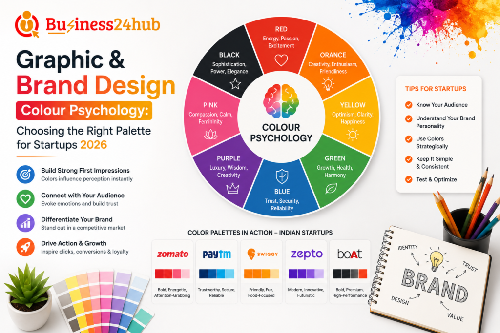
- 3 The Psychology Behind Individual Colours
- 4 How Colour Perception Differs Across Audiences
- 5 Step 1: Define Your Brand Personality Before Choosing Colours
- 6 Step 2: Research Your Industry’s Colour Landscape
- 7 Step 3: Choose a Primary Colour That Anchors Your Identity
- 8 Step 4: Build a Supporting Palette, Not Just One Colour
- 9 Step 5: Consider Colour Contrast and Accessibility
- 10 Step 6: Test How Your Palette Performs Across Platforms
- 11 Step 7: Build in Flexibility for Different Use Cases
- 12 Step 8: Avoid Common Colour Psychology Mistakes
- 13 How AI and Design Tools Are Shaping Colour Choices in 2026
- 14 A Practical Example: Choosing a Palette for a Wellness Startup
- 15 Frequently Asked Questions (FAQs)
- 16 Conclusion
- 17 Need a Social Media Marketing Content Calendar for Your Business?
Introduction
Before a single word of your brand messaging is read, your colour palette has already started forming an impression. Within seconds of seeing your logo, website, or packaging, a potential customer has unconsciously made judgments about whether your brand feels trustworthy, premium, playful, or forgettable — and colour is doing most of that work.
For startups, this matters enormously. Unlike established brands with decades of recognition to fall back on, a startup’s colour palette often carries the entire weight of first impressions. Choosing colours based on personal preference or whatever looks trendy on social media can quietly undermine months of product and marketing effort. This guide breaks down the psychology behind colour choices and offers a practical, structured way for startups to choose a palette that actually supports their brand strategy in 2026.
Why Colour Psychology Matters for Startups
Colour influences perception faster than almost any other branding element, partly because the human brain processes visual information, including colour, before it processes text. This means your palette is often shaping a viewer’s emotional response before they’ve even understood what your product does.
For a startup specifically, this has practical business implications. The right palette can communicate trust to a hesitant first-time buyer, signal premium positioning to justify higher pricing, or create the kind of memorable visual identity that helps a brand stand out in a crowded category. The wrong palette can do the opposite just as easily, making a genuinely strong product feel cheap, generic, or mismatched with its actual target audience.
The Psychology Behind Individual Colours
While colour perception does have some cultural and individual variation, certain associations are consistently strong enough to build a reliable brand strategy around. Understanding these associations is the starting point for any palette decision.
Blue is widely associated with trust, stability, and professionalism, which is exactly why it dominates industries like banking, healthcare, and technology, where reliability is a primary selling point. Red carries energy, urgency, and passion, often used to drive action, which explains its frequent appearance in food brands and clearance sales. Green signals growth, health, and sustainability, making it a natural fit for wellness, finance, and eco-conscious brands.
Yellow conveys optimism, warmth, and approachability, though it needs to be used carefully since it can feel overwhelming or cheap in large quantities. Orange blends the energy of red with the friendliness of yellow, often used by brands wanting to feel bold yet accessible. Purple has long been associated with luxury, creativity, and wisdom, making it popular among premium and creative-sector brands. Black communicates sophistication, authority, and exclusivity, frequently used in luxury and high-end positioning. White suggests simplicity, cleanliness, and minimalism, often paired as a supporting colour to let other elements breathe.
How Colour Perception Differs Across Audiences
While these associations provide a useful starting framework, they’re not universal absolutes. Cultural context significantly shapes how colours are interpreted. In many Western markets, white is associated with purity and weddings, while in several Asian cultures, white carries strong associations with mourning. Red signals danger or stop in some contexts, but represents prosperity and celebration in others, particularly across much of Asia.
Age and gender also influence colour perception, though often less rigidly than older marketing assumptions suggested. Younger audiences in 2026 tend to respond well to bold, saturated colour combinations and unconventional pairings, while audiences in more traditional B2B or financial categories often still favour conservative, lower-saturation palettes regardless of age. Rather than relying on broad generational stereotypes, the safest approach is researching how your specific target audience actually responds to colour within your industry and region, rather than assuming a universal rule applies everywhere.
Step 1: Define Your Brand Personality Before Choosing Colours
Colour selection should never be the first branding decision a startup makes. Before opening a colour palette tool, define your brand’s core personality traits in clear, specific language. Is your brand bold and disruptive, or calm and reassuring? Premium and exclusive, or accessible and friendly? Playful and energetic, or serious and authoritative?
These personality traits should come directly from your actual positioning and target audience, not from what feels personally appealing to the founder. A fintech startup targeting cautious, first-time investors needs a fundamentally different colour personality than a youth-focused fashion brand, even if both founders personally gravitate toward the same favourite colour.
Step 2: Research Your Industry’s Colour Landscape
Once your brand personality is defined, study the colour patterns already dominant in your industry. This isn’t about copying competitors, but about understanding the unspoken visual expectations your audience already carries. Healthcare and finance categories lean heavily on blue and green for trust and stability. Food and beverage brands frequently use red, orange, and yellow to stimulate appetite and energy. Luxury and premium categories consistently favour black, deep jewel tones, and minimal colour palettes to signal exclusivity.
Understanding these patterns gives you two strategic options: align with industry expectations to immediately signal credibility within your category, or deliberately break from them to stand out as a disruptor, which can be powerful but requires extra effort elsewhere in your branding to avoid confusing potential customers about what category you’re actually in.
Step 3: Choose a Primary Colour That Anchors Your Identity
Your primary colour should be the one most strongly associated with your brand across every touchpoint — your logo, your website’s dominant colour, your packaging, and your social media presence. This colour carries the heaviest psychological weight, so it deserves the most deliberate consideration.
Choose your primary colour based on the single emotional response you most want your brand to trigger. If trust and reliability matter most, blue remains a strong, well-tested choice. If energy and urgency matter most, red or orange may serve better. If premium positioning is central to your pricing strategy, black, deep purple, or muted jewel tones tend to outperform bright, playful colours.
Step 4: Build a Supporting Palette, Not Just One Colour
A single colour rarely carries an entire brand identity effectively. Most strong startup brands build a palette of three to five colours that work together: a primary colour, one or two secondary colours that complement it, and one or two neutral tones, typically variations of white, grey, or black, that provide visual breathing room and support readability.
Without neutrals, even a beautifully chosen primary colour can feel overwhelming when applied across an entire website or app interface. Neutrals also play a critical, often underestimated role in keeping text legible and interfaces usable, which directly affects user experience and, ultimately, conversion rates.
Step 5: Consider Colour Contrast and Accessibility
In 2026, accessibility isn’t an optional nice-to-have — it’s an expectation, and increasingly a legal consideration in several markets. Your palette needs sufficient contrast between text and background colours to remain readable for users with visual impairments, including various forms of colour blindness, which affects a meaningful percentage of any population.
Beyond legal and ethical considerations, poor contrast simply hurts usability for everyone. A beautifully designed palette that’s difficult to read on a mobile screen in bright sunlight, or that becomes nearly invisible for colour-blind users, actively works against your conversion goals. Testing your palette using accessibility contrast checking tools should be a standard step before finalizing any brand colour decision, not an afterthought addressed only if a complaint arises.
Step 6: Test How Your Palette Performs Across Platforms
A colour palette that looks striking on a designer’s high-resolution monitor doesn’t always translate consistently across every platform your brand will actually appear on. Mobile screens, different operating systems, print materials, and various social media platforms can all render the same colour values slightly differently.
Before finalizing your palette, test how your chosen colours appear across the specific platforms your audience will actually encounter your brand on — your website on both desktop and mobile, your social media profile and post templates, any physical packaging or print materials, and app interfaces if relevant. Small adjustments at this stage prevent the frustrating experience of discovering your “perfect” palette looks washed out or harsh in a context you hadn’t tested.
Step 7: Build in Flexibility for Different Use Cases
Your core brand palette needs to work across a wide range of applications, from a small app icon to a large outdoor banner, from a light website background to a dark mode interface increasingly expected by users in 2026. Rather than choosing colours that only work in one specific context, test your palette’s flexibility across these varied scenarios early.
This often means defining tints and shades of your primary colours, lighter and darker variations that maintain the same psychological character while adapting to different backgrounds, sizes, and contexts. Many strong startup brand systems include a documented range of these variations specifically to maintain consistency as the brand scales across new platforms and use cases over time.
Step 8: Avoid Common Colour Psychology Mistakes
Choosing colours purely based on personal preference rather than audience research is one of the most frequent mistakes startups make, often resulting in a palette that reflects the founder’s taste rather than the brand’s actual positioning or target customer.
Using too many colours without a clear hierarchy is another common issue, creating visual confusion rather than a cohesive identity. A focused palette of three to five well-chosen colours almost always outperforms a scattered approach using six or more competing tones without clear roles.
Ignoring cultural context when targeting multiple markets can also backfire, particularly for startups expanding beyond their home market without researching how colour associations shift across different cultural contexts.
Following short-lived design trends too closely is a subtler but equally damaging mistake. A palette built entirely around what’s currently popular on design platforms often ages poorly within a year or two, requiring an expensive rebrand sooner than necessary, compared to a palette built on more enduring psychological principles paired with a few current, lighter trend touches.
How AI and Design Tools Are Shaping Colour Choices in 2026
AI-powered design tools have made palette generation faster and more accessible than ever, instantly suggesting colour combinations based on a single uploaded image, a competitor’s website, or a simple text description of desired brand personality. These tools are genuinely useful for rapid exploration and generating starting points a small startup team might not have arrived at manually.
However, relying on AI-generated suggestions without applying genuine strategic judgment carries real risk. Many AI tools optimize for what looks visually pleasing or currently trending, without necessarily understanding your specific industry positioning, target audience psychology, or long-term brand strategy. The most effective approach in 2026 treats AI tools as a fast way to generate options, while the final decision still rests on the deliberate, audience-informed process outlined throughout this guide.
A Practical Example: Choosing a Palette for a Wellness Startup
Consider a startup launching a mental wellness app targeting young professionals dealing with workplace stress. Their brand personality is defined as calm, trustworthy, and approachable, deliberately avoiding the clinical coldness sometimes associated with healthcare apps.
Researching their category reveals heavy reliance on blue and white across competitor wellness apps, signalling an opportunity to differentiate slightly while still maintaining enough category familiarity to feel credible. They choose a soft, muted green as their primary colour, evoking calm and growth without feeling clinical, paired with a warm, light neutral as a secondary tone for warmth and approachability, and a deep charcoal grey rather than pure black for text, softening the overall feel while maintaining strong readability.
Testing across platforms reveals their initial green appeared slightly too pale on mobile screens in bright outdoor lighting, prompting a small saturation adjustment that maintained the calm personality while improving real-world legibility. This kind of iterative, tested decision-making, grounded in both psychology and practical platform testing, consistently produces stronger results than a palette chosen purely on aesthetic instinct.
Frequently Asked Questions (FAQs)
1. What is colour psychology in graphic and brand design?
Colour psychology is the study of how different colours influence people’s emotions, perceptions, and purchasing decisions. Choosing the right colour palette helps startups create a strong brand identity and connect with their target audience.
2. Why is choosing the right colour palette important for startups?
A well-planned colour palette improves brand recognition, builds customer trust, creates emotional connections, and ensures a consistent visual identity across websites, social media, and marketing materials.
3. Which colours are best for startup branding in 2026?
The best colours depend on your industry and brand personality. Blue represents trust, green symbolizes growth, red creates excitement, yellow conveys optimism, black reflects luxury, and purple is associated with creativity and innovation.
4. How many colours should a startup use in its brand palette?
Most branding experts recommend using 3–5 primary and secondary colours to maintain consistency while keeping the brand visually appealing and easy to recognize.
5. Can the wrong colour palette affect a brand’s success?
Yes. Poor colour choices can confuse customers, weaken brand recognition, reduce trust, and make marketing materials less effective. A strategic colour palette improves user experience and brand recall.
6. How do I choose the right brand colours for my business?
Consider your target audience, industry, brand values, competitors, and the emotions you want your brand to evoke. Testing colour combinations across digital and print platforms can help you make the best choice.
7. Should startups keep the same brand colours across all platforms?
Yes. Maintaining consistent colours across your website, logo, social media, advertisements, packaging, and marketing materials strengthens brand identity and improves customer recognition.
Conclusion
A startup’s colour palette is far more than a cosmetic decision — it’s a strategic tool that shapes first impressions, signals positioning, and influences how trustworthy, premium, or approachable a brand feels before a single word is read. Treating colour choice with the same strategic rigour applied to pricing, messaging, or product decisions consistently produces stronger, more durable brand identities than choosing colours based on personal taste or short-term trends.
The startups that build genuinely memorable, effective visual identities in 2026 aren’t necessarily the ones with the boldest or most unique colours. They’re the ones that ground their palette decisions in real audience psychology, test rigorously across real platforms and use cases, and build in enough flexibility to scale and adapt as the brand grows, rather than locking in a choice based on a passing trend or a founder’s personal favourite shade.
Need a Social Media Marketing Content Calendar for Your Business?
🟡Business24Hub provides complete IT, web development, software development, digital marketing, branding, SEO, mobile app development, and business consulting services to startups, entrepreneurs, SMEs, and enterprises across India.
🟡For other Legal and Trademark related services Visit
👉 Money Recovery Cases
👉 Property Disputes
👉 Business & Licence Registrations
🟡 Protect Your Rights
👉 Domestic Violence Legal Support
👉 Stridhan Recovery
👉 Mutual Consent Divorce
👉 Contested Divorce Filing
👉 Child Custody and Maintenance
👉 Matrimonial Property Settlement
👉 NRI Divorce Services
👉 Alimony and Maintenance
📞 Call Now: +91 8595439395
🕐 Free Consultation: Monday to Saturday, 10 AM to 6 PM

I’m Aryan Yadav, passionate about SEO and Digital Marketing with a strong interest in helping businesses grow online. I enjoy learning new strategies, exploring digital trends, and creating ideas that deliver value. I believe in continuous growth, creativity, and building meaningful results through smart work and dedication.

